Would you ever buy from an ecofriendly brand that uses plastic bottles?
This is brand inconsistency!
Every branding element (including logo, messaging, fonts, visuals) should offer a uniform feel. Otherwise, it could be a big turn off for buyers that costs the companies their reputation and revenue.
Apple doesn’t compromise on its brand identity, ever!
That’s the reason you can easily spot if you’re buying an original Apple product or not. Now, it’s your turn to spot key inconsistency signs in your brand and fix them.
Why Consistent Branding Matters?

Keeping your brand consistent helps you in maintaining an identifiable image!
Your visual choices, logo selection, messaging pattern, and typography all make up your brand unique and memorable. In other words, your customers will know when they’re buying from you or it’s a copycat brand. Here’s how keeping your brand consistent helps you:
- Firstly, you can earn customers’ trust across all touchpoints during the buying process.
- Just like KFC’s strong brand image despite various infringement scenarios, you can create brand loyalists, too.
- Brands witness up to 18% growth in revenue with a consistent brand identity (Marq).
Key Brand Inconsistency Signs (& How to Fix Them)
One of the challenges that established brands face is to maintain consistency as they scale. Team expansion, multiple communication mediums, or business growth all contribute to brand inconsistency challenges. But these issues can be identified and resolved for making your brand consistent and recognisable instantly.
Below, we’ve discussed key brand inconsistency signs and how you can fix them!
Sign #1: Inconsistent Logo Options
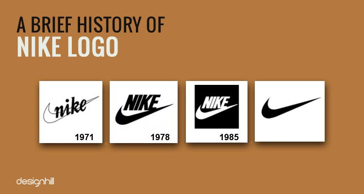
People recognise your brand from the logo. If your logo has different variations on different platforms, your customers fail to develop a connection with your brand.
Take Nike as an example!
You’ll find the same “Swoosh” sign on every touchpoint whether online or in their stores. You can instantly tell it’s a Nike brand even without its name.
You need to address this brand inconsistency first!
Work with standardised logo variations that that can be easily identified by your consumers.
Sign #2: Conflicting Colour Palette Usage
You’ll instantly recognise its Pepsi upon looking at blue, white, and red colours!
It’s because colours play an important role for creating an irresistible brand image. And switching to different colour palettes can lead to inconsistent brand issue.
You need to define colours for every touch point starting with primary and secondary palette selection. Record the hex code, pantone colours and their RGB values for later use. And share it with your design/development teams to avoid using different colour schemes in your creatives.
Sign #3: Inconsistent Typography in Designs
The use of typography in branding is another issue that many companies often overlook!
Look at New York Times and you’ll find a specific font in their articles – Georgia. Using the same font family in their digital and print media makes them a consistent brand.
Now you need to work on your typography guide to avoid using different fonts in every design.
Pick a font for head, another option for subheading, and designate a specific font for body section. And you can bring a uniformity in your designs that make every other visual connected to previous one.
Sign #4: Changing Brand Messaging
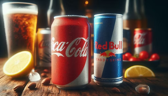
Changing messaging or tone is another sign of inconsistent branding that makes companies suffer in terms of negative PR!
Imagine Coca Cola, known for uplifting and positive brand messaging, shifts towards an energetic tone like Red Bull. People will instantly spot the shift, and a new debate will be initiated that might not go in their favour. Simply because it’s not how Coca Cola communicates.
To fix this inconsistent branding issue, you need define core messaging pillars for your brand. And stick with it while writing taglines, social media captions or other marketing material.
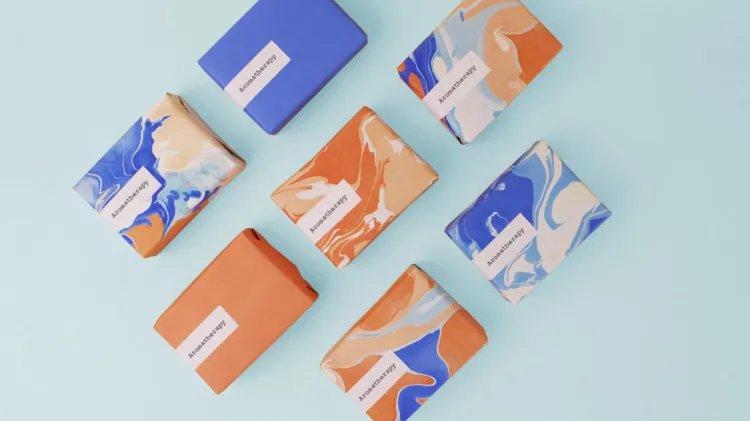
Sign #5: Your Visuals Don’t Just Match

Variable visual selection has a huge impact on inconsistent branding!
You may have seen brands that switch to real-life photos to vector in their designs. This approach for changing visual selection too often leads to unappealing visual identity of your brand.
You need to create a visual style guide that constitutes your choices whether to use photos or go with vectors. For example, you’ll never see real life images in Mailchimp’s branding. It’s because they’ve set the brand’s perception using vector graphics. And switching back to other visual formats may lead to negative perception of their brand image.
Conclusion
These are key issues that cause brand inconsistency!
You may overlook colour selection once, ignore social media visuals but these issues pile up. And result in an inconsistent brand before you even know. The famous brands like Apple or Red Bull don’t just make quality products. They invest in their brand identity while avoiding these issues.
Now, you must spot these signs in your brand to ensure it’s consistent in every aspect. From fonts to logo and messaging, your brand should demonstrate a uniformity.
Comment below to share how you’ve spotted inconsistent branding signs and how you fixed them?