Ever thought why retail brands use red in their logos? Or why do non-profit organizations excessively rely on white people in their advertising?
Brands have a deeper connection with color psychology that we often fail to understand!
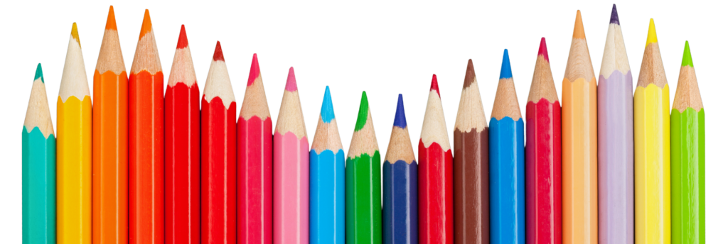
Each color has a specific meaning that brands use to invoke a certain feeling. And we’re here to describe each emotion associated with the major colors that brands use. Knowing what colors speak to our eyes will help you in designing the best logo, website, or ad, maybe.
Let’s dive in and discuss color psychology!
What’s Color Psychology? (& Why It’s Important)
New to color psychology concept?
Color psychology discusses the concept of how different colors impact our minds. Red apples, yellow cabs, or blue sky all capture our attention faster than other objects lying next to them. In short, this study of color psychology helps designers keep the graphics as close to their key objectives as possible – grab attention!
Businesses, ad agencies, and designers can use color psychology for:
- Influencing consumers’ purchasing decisions
- Invoking certain emotions around their products
- Making a cultural association with their products
- Improving their product’s visual appeal
How Different Brands Use Colors?
Now that you’ve understood the basics of “Color Psychology”, let’s move to the next part. Using certain colors can positive or negative impact on your overall branding. Plus, you can amplify the impact of your message by cracking the code to the right color selection.
Let’s discuss how and why businesses use certain colors in their branding. And how you can select the right color for yours, too.
Color Blue – Dependable, Calming & Trustworthy Vibes
Let’s start with the color blue, which you’d often see in a technology company’s logo!
Blue offers various positive meanings, such as trustworthiness and a calming effect when used strategically in branding. From a design point of view, the color blue can make your brand look more dependable and professional.
A common example is IBM, Intel, and Dell, which use the color blue in their branding!
If you’re seeking to represent your company as a dependable and professional organization, blue could be the perfect option. Plus, you’ll find various shades of blue to smartly adjust in your designs, too.
Color Green – For Growth-oriented & Stable Brands!
While studying color psychology for your brand, you’ll often see the usage of green!
Green often exudes natural and healthy feelings, and that’s one of the reasons why health-related brands choose this color. Using green in your branding can establish you as an environmentally conscious entity.
Take Starbucks, which balances between white and green in their branding!
You’ll also find two main shades of green (light and dark) that offer subtly variable meaning. Brands opting for light green successfully position themselves as a natural and organic option. And if you’re seeking to add the element of a stable option, you may go for a dark green color option.
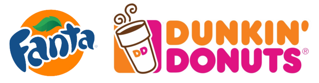
Color Orange – Establish Friendly, Playful & Energetic Brand Presence
While we’re discussing color psychology, not mentioning orange would be unfair to this list!
Orange has an energetic vibe when you incorporate it in your designs. This color can easily establish your brand as a playful, friendly choice.
Most retail companies make use of the orange color, such as Fanta and Dunkin!
They not only make the product more visible by incorporating orange but also affordable.
This could be a perfect choice for you if your product is for youth who seek quality but cost-effective products.
Or you may create an enthusiastic feeling around your brand by using the orange color in your designs.
Color Red – For Ambitious, Energetic & Powerful Brand Image
Now comes the easiest color option any brand would want to choose – red color!
Let’s focus on why red is preferred over discussing why it’s an overly used color option for now. Firstly, this color easily grabs attention regardless of industry or the product. Secondly, red is also an ideal choice if you’re introducing a product associated with boldness or passion.
A good example of red color usage is Target, KFC, and Coca-Cola!
You’ll find retail and FMCG companies that heavily rely on the color red when it comes to diverting attention to their products.
Cherry, Rose, Maroon, and Scarlet are different shades of red that you may consider for your brand.
Color Yellow – For Making Your Brands More Optimistic!
Last on our radar, the yellow color is another famous choice when you want to incorporate it in the branding!
If we study yellow’s color psychology, this option offers your brand a cheerful and warm feeling. From Lay’s to Subway and McDonald’s, most food and beverage brands make use of this color option.
By incorporating yellow color, you can successfully include a touch of optimism in your products. Plus, this can be an ideal choice for your brand if you’re trying to achieve a sense of cheerfulness.
Endnote
And with this, our list of famous color brands that make use of them ends here!
Now that you’re aware of color psychology, it’s time to put it to the right use. And if you’re seeking to choose the right color, follow these tips:
- Start with color psychology
- Develop an understanding of color emotions
- Take inspiration from your key competitors
- Invest in your brand’s color palette
- Study the cultural connection of each color option
- Keep your branding consistent
If you need more information on how to select the right color option, our branding experts are here to help.